Brand
Wordmark, palette, voice.
The Kalinklo identity, ready for press, partners and programme editors.
Download logo packZIPTransparent SVG and PNG files. The SVG artwork uses outlines and needs no installed fonts.
Wordmark
How we sign our name
Keep the proportions and colours. Leave at least the height of OS clear around the mark and display it at 160 px or wider. Use the light-surface file on light backgrounds and the reversed file on dark backgrounds.
Palette
Live swatches
Accent navy
#33569CPrimary action, links, focus — and the Run the Week engine
Patina teal
#176273Secondary accent — and the Manage the Engagement engine
Ink
#101A33Headlines, dark surfaces, and hierarchy
Wordmark gold
#E7CD8AThe OS accent in the site header
Body
#46506BBody prose, captions, and supporting metadata
Muted
#525E74Eyebrows, quiet labels, and secondary metadata
Canvas
#F5F6F7Page canvas; cards lift on #FFFFFF above it
Hairline
#E1E3E8Borders, dividers, and quiet structure
Typography
These typefaces use the SIL Open Font License 1.1. Review each font's license at its source.
Editorial headings
Spectral
Spectral · SIL OFL 1.1Body and interface
Hanken Grotesk
Hanken Grotesk · SIL OFL 1.1Labels and numerals
IBM Plex Mono
IBM Plex Mono · SIL OFL 1.1Product images
Existing localized product views with sample data. Keep the sample captions when reproducing them.
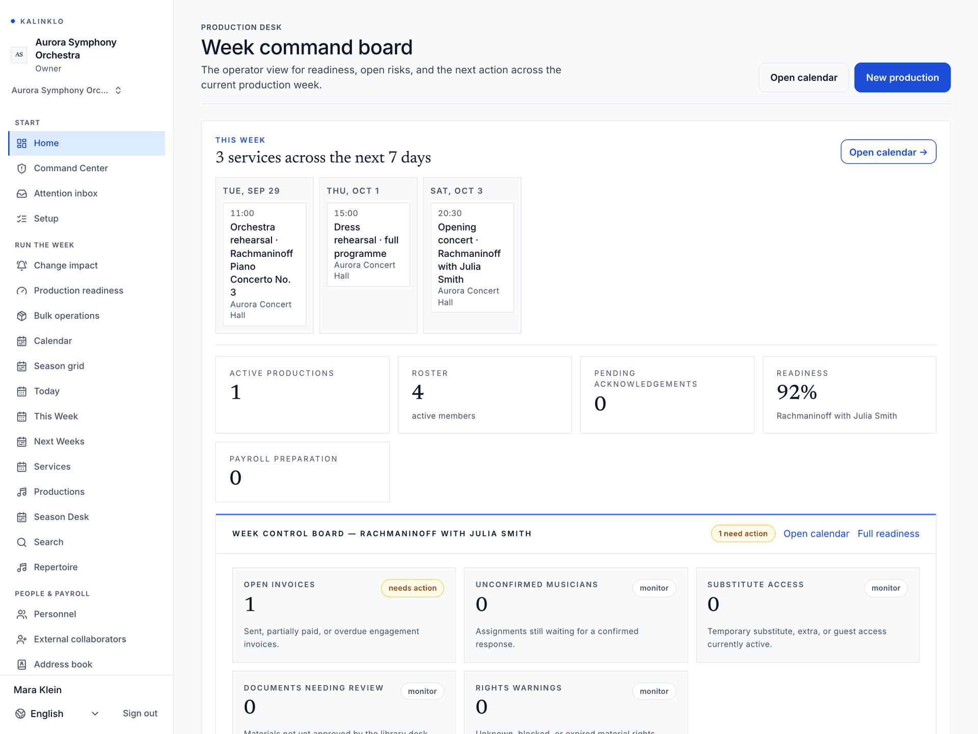
Production team
Product screens from a sample workspace.
Download image · PNG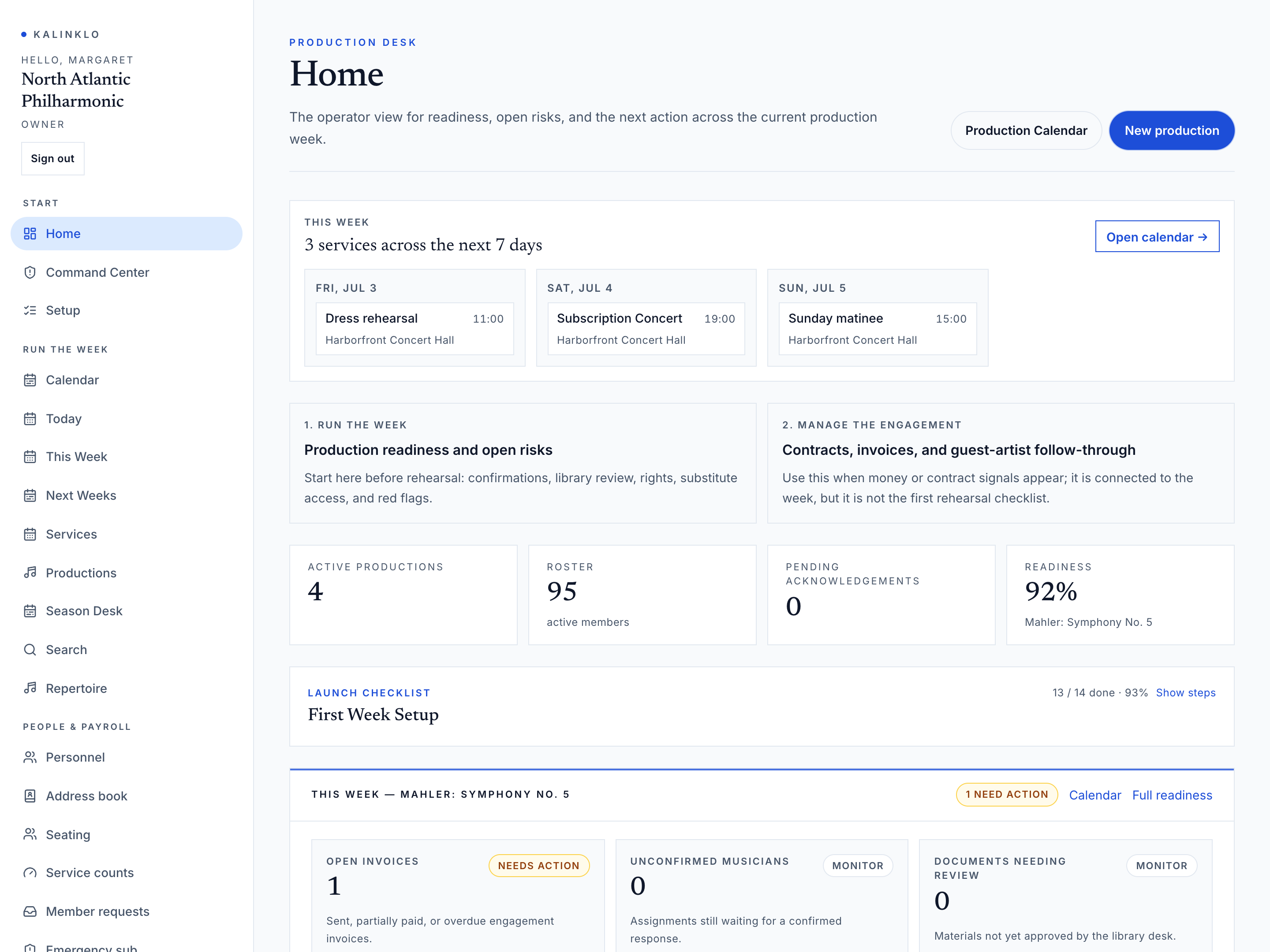
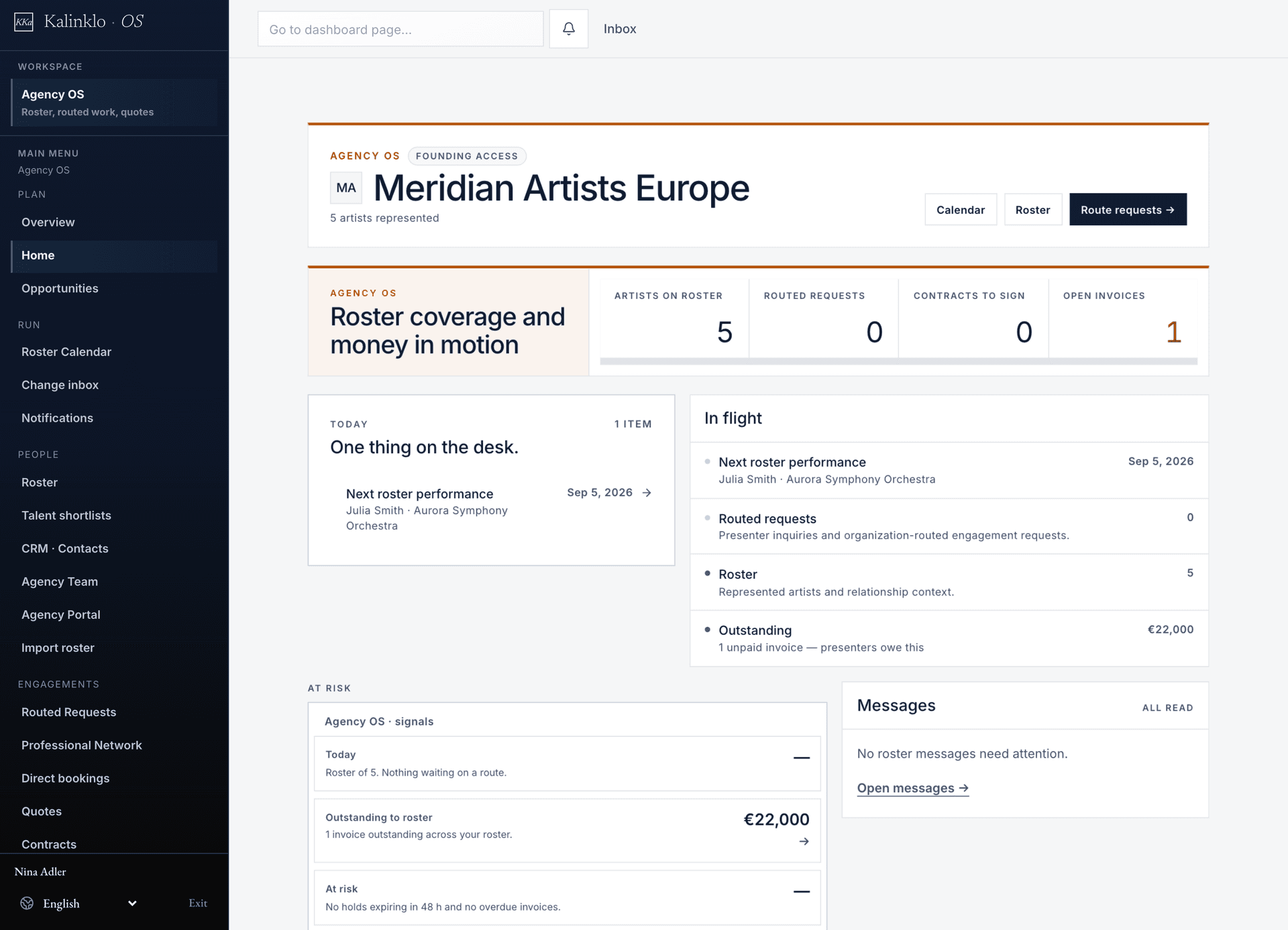
Agency OS
Product screens from a sample workspace.
Download image · PNG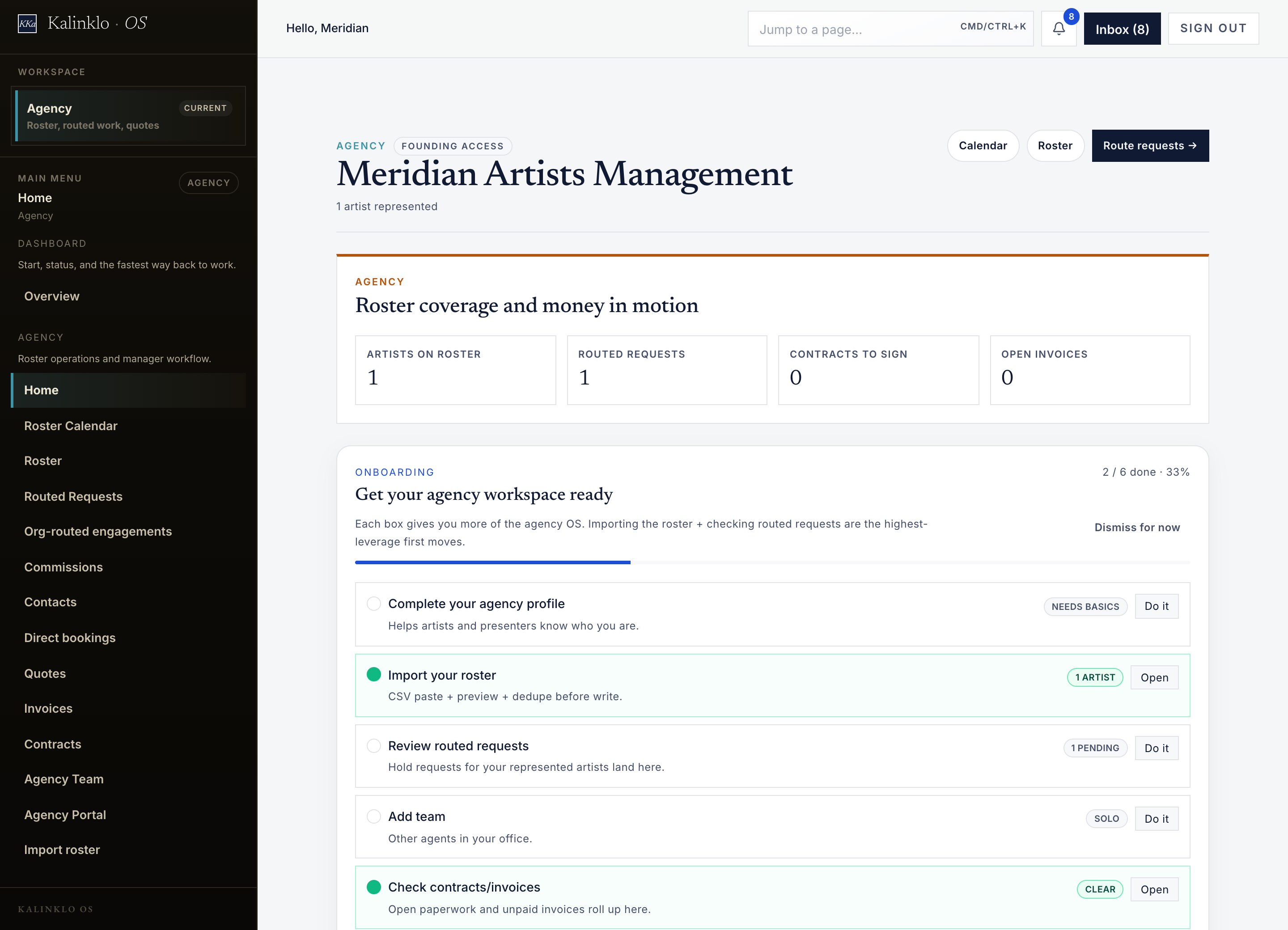
Usage
Using the identity
Two operating systems, named consistently
Kalinklo is one platform with two operating systems: Run the Week for organizations and Manage the Engagement for artists, agencies and presenters. Use the module names Production Desk, Agency OS, Engagement Ledger and Studio.
Names and attribution
Use the supplied names and product descriptions. Do not imply a customer relationship, partnership or endorsement without permission.